Wednesday, 11 December 2013

History of Love

The last final piece to be completed for this end of term deadline haul! 
It's been a mission, but MISSION COMPLETE!

"Just open your palm to say forgive me."

I chose this quote because I found it quite striking out of the whole extract. 
It's a fairly simple piece, but there is actually more design depth than perhaps you initially see.
The background patterns are made up of things which symbolise forgiveness:
  • Row one is an African Adinkra symbol
  • Row two is a mixture of daffodils and hyacinths
  • Row three, the chinese symbol for forgivness
  • Row four is "Forgive" in braille
I also used the colour orange to colour my background because that is the colour to signify forgiveness. It has a underlying theme throughout.


Extract from the novel 'History of Love' by Nicole Krauss


Here are just a few of the colour developments I went through to choose my final colour palette. 
I did this using my drawing tablet in photoshop

Mediums used: Gouache paint on black mount board.

Tuesday, 10 December 2013

'Tis the Season to give presents

Amongst my crazy end of term deadlines I managed to whip up this crafty Christmas gift.


I used a glass bauble with a removable top so that I could insert the artificial snow, and the name tag. Then I tied the bow on top and attached some nice embroidery thread to have the decoration from.
The little "homemade" label was just a silly little idea, but it was fun to pretend like it was a product.


Then to top it off I created a quick christmas card, to go along with the snow in the bauble. I used some doilies and stuck them onto white card. This gave a very subtle background, but with the brown christmas tag I think it worked well in looking quite elegant.


Thursday, 5 December 2013

Secret Santa

For my connect group, with upcoming christmas and a last social meeting before the holidays, we were all set the task of giving each other a £1 Secret Santa, but to be as creative as we can be. 

I'm not sure mine was quite £1... but it was fun to make and I don't mind having spent a bit more. I thought it looked really cute, and having a guy to give a present too, it can be quite restrictive in possibilities. However I think this gift idea is great for anyone.

I got my recipe from allrecipes.co.uk - However my jar was a little smaller, so I just halved all the ingredients, which would make 12 cookies.


Three labels: A generalised 'Merry Christmas'; The recipe card which explained how to make the cookies and what to add - because the jar only contains the dry ingredients; and then the third was something I came up with, where it gives some examples of what to do with the jar when it is empty: make a snow globe; pen pot etc.


I wanted a red and white Christmas Knit pattern, which I painted on with gouache.

Tuesday, 5 November 2013

Fisherman's Eggs

You are handed a receipt from little Waitrose, and the only two purchases were a box of free range eggs and a tin of sardines. 
Illustrate.

This was the task set. It was titled 'Fish and Birds' and the aim of the brief was to create something great and less average, from what could initially be interpreted as a very boring brief.

Recipe Page FINAL
Rope typography for the recipe title - a fisherman motif influencing the letterform 
Creating the waves
Creating the waves involved making sure that each colour section of the waves would be applicable on top of each other. This meant cutting out less of the colour each layer. For example, the darkest blue [colour 3] was solid, and then the middle blue [colour 2] had the sections cut out to reveal the section of colour 3 that was needed to create the wave patter; and so on.
Adding pattern to the paper-cut pieces
Originally it was just going to solid colour, as in my original plans I was going to use gouache as my medium of colour, and therefore I could paint in shade and tone. However I ended up using papercutting as it was creating a much more crisp and professional looking finish. 

However the block colour looked a little too flat and so I ended up using small dot and hash patterns for the life-ring and the lightest blue [colour 1] of the wave. 
Writing detail

I used medieval script influences for my final design. It influenced the pattern, but also the text. Each subheading I used I wanted to be bold and clear, but still have a particular design feature to them; whereas I wrote the recipe out in just my own handwriting. 


The medieval influence can also be seen in the wave like patterns and shapes used on top of the fisherman and sea motifs. The flowing, curling lines which mimic the wave pattern along the bottom, and also bring all three colours to the top of the image, drawing it all together.


The mess my desk undertakes as I work on a project. Always a mission to find anything!

Monday, 28 October 2013

Marbin

 It's one of my best friends 20th Birthday coming up super soon, and I have been browsing the inter webs for days now trying to find something good to send as a present, and although I came across a few contenders I couldn't choose. In the flipped a film on and got my craft on and ended up making a paper cutting piece of her nickname.

Final piece in decorative frame
Paper cutting in process (8x6 inches)

Sunday, 27 October 2013

'The Blue Pet'

We were all given the same piece of text and given the task of interpreting it into something suitable for a 5 page baby book [including the cover page]. Each page was 16.5x16.5cm and we weren't allowed to use any text on the pages. They had to purely be illustrations which would easily convey what the character was going through. 

COVER PAGE - Rendered text will go in the clear space without the snow

PAGE 1 - Lonely and Lost but finds the house

PAGE 2 - Inside he meets the dog by the fireplace

PAGE 3 - he then meets the cat on the sofa

PAGE 4 - he finally feels comfortable sleeping in the washing basket

It was a very interesting task because you'd think simplifying something for a young audience would be quite easy, but because you were simplifying things that you knew about it made it tricky. I especially had trouble making the animals fit in with the style of my blue pet character which was very "blobby" and made up of rounded shapes.

I ended up taking the Christmas setting from the text and the meeting of all the different animals, but then having it that the Blue Pet was lonely and lost on Christmas, and he's wandering around in the snow and finds the house where he meets a few of the animals. He tries out their sleeping positions and places but doesn't feel very comfortable; until he finds his comfortable sleeping spot which ends up being the washing basket.

Oh I do like to be beside the Seaside!

Choosing the location of the beach, the theatre or the zoo we were tasked with making a 10 panel [including the front and back cover] concertina book from the characters we have previously developed from ink  "squiggles".
We were allowed to use any mediums, work on any surfaces, as long as it had the correct number of panels, they were all 10x10cm and the whole book stood up when open.

I based mine at the beach and went for the motion that over the period of panels it would have a separate narrative for each panel, but would also have an overall narrative across the book. This was also illustrated using a wave motion, where on the first page the wave started in the lowest corner, progressively rose so that two pages were fully underwater scenes, and then decreased back down again, over the 8 panels. 

I ended up working on cardboard and painted the illustrations using gouache.
Front cover onwards...
...to back cover
the "wave" rising over the panels
...and decreasing again
the concertina effect
I used two lengths of string from the front cover all the way along the back of each panel, to the back cover, top and bottom so they were all secure, and would also stand up when open.

Tuesday, 8 October 2013

#MoxonWedding

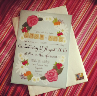
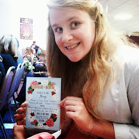
Invitation
Over the summer I had the honour of designing the stationary for Amy and Josh's wedding. 
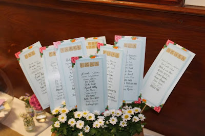
This involved their invitations, an order of service, the seating plans and the table number cards. 
I was given the colour of the bridesmaid dresses to base the work on, the scrabble lettering to reflect their love of board games, and the general colours of the flowers which were to form a wreath around the text. Then with each extra piece of work I just developed the original invitation design to keep a clear connection between each, but with a slight difference to create a piece which could stand on its own as well.

It was such a great project to be producing something for such a wonderful event and for such a good friend, but it also was a great learning curve. I have made cards for many years now, but never have I had a real "live-project" and worked to someone else's brief. I learnt a lot about crop and bleed of printing specifications; making sure that type would be readable and so on. 

All pieces were done using a drawing tablet in photoshop where the flowers were sketched and drawn in and all the type hand drawn as well.

Order of Service


Seating plans

Friday, 4 October 2013

Hannah, Bamber and Biccie

Happy 22nd Bamber, and 21st Biccie! For once I'm the baby of the group!

Mediums used: drawing tablet in photoshop

Wednesday, 10 July 2013

Owl Post


A little while back I found out and managed to get to the Graphic Art of the Harry Potter Films, which would be exhibiting work by the graphic artists Miraphora and Eduardo - MinaLima. It was such an amazing opportunity to look at the work in great detail. What was even more amazing, and I still can't get over til this day - both Miraphora and Eduardo were there, and they talked to us! It was so interesting to hear about their work, and so lovely for them to take the time to talk to us and point out little design secrets. They are a bit inspiration to me, and to actually meet and talk to them - yep. I therefore wanted to make them a thankyou card. I then got pretty carried away! It went from a card design to a full blow mini-craft-project!
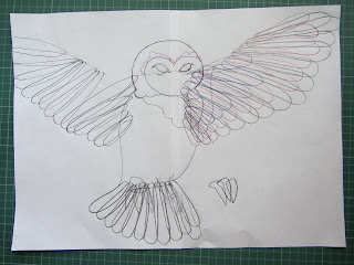
Owl diagram and plan
I drew out the design for the owl and then I was able to apply the feathers on top of each other, separately, into the correct formation.
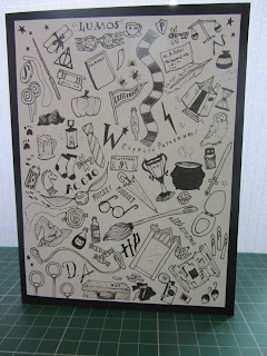
Final Card
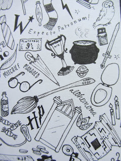
Close up of some of the card illustrations

I originally had a few thumbnail ideas of possible cards, but I ended up going for a collaboration of different Harry Potter related objects, all in monochrome.
Mounting the illustration onto the black card, really work well with the black ink illustrations, and really brought them out.
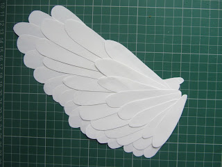
Completed wing, with separate feathers

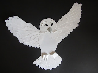
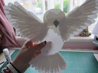
The wings of the owl were crafted from the original design. I used it as a template for layering the feathers in the correct formation, to get that wing-span shape. All the feathers were cut separately, so that on the back of the bird, you can still see all the feathers.
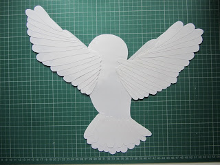
Owl: BACK
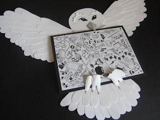
Final paper-constructed Owl 
Holding the owl up to the light clearly highlights all the wing construction

I wanted to make the owl hold the card-envelope.
To make with possible, the beak and neck feathers are only glue at the top, and the feet are glued at the bottom of the talons. This way, the letter can be slipped under at both ends of the owl, and it will be as though the owl has the letter in its mouth, and the talons keep it secure.

 The whole point of the design was to have the owl - based on Hedwig - carrying the well known Harry Potter-Hogwarts style envelope.
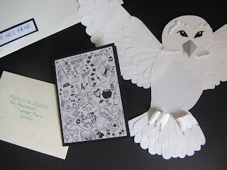
Full collection of pieces