Wednesday, 12 March 2014

Far away in the Midlands Business School...

Recently I got asked to help out a friend with their dissertation where one of the components they had to submit was in a story-book form. I was asked to produce a cover page and the typography for the chapter pages. 

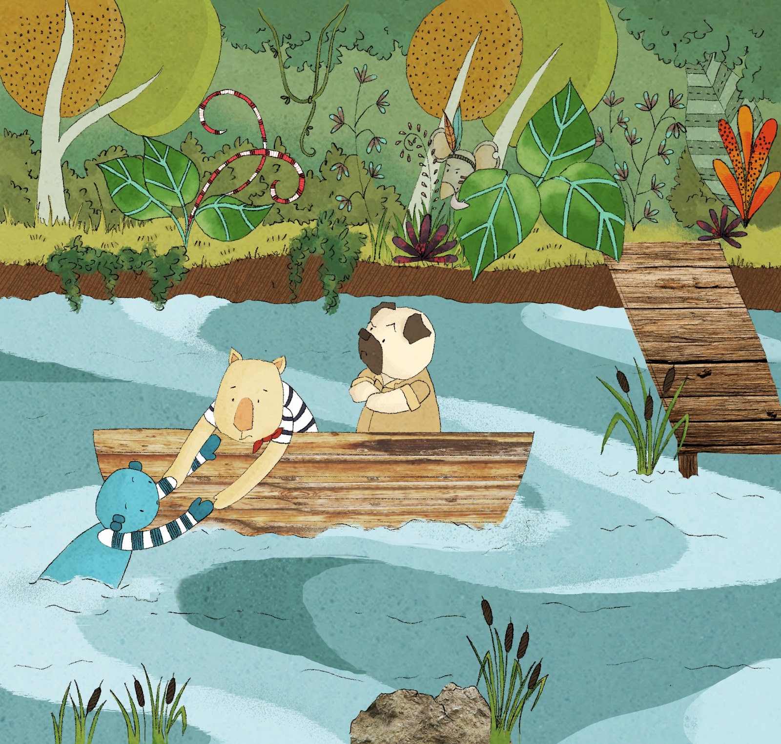
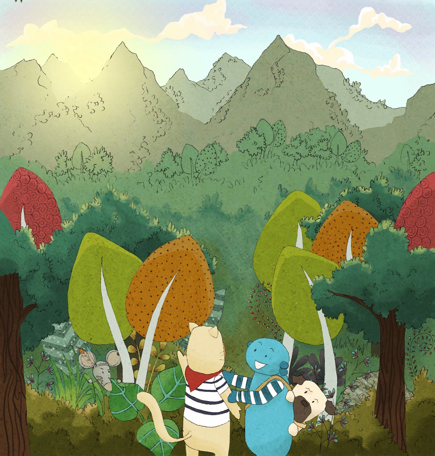
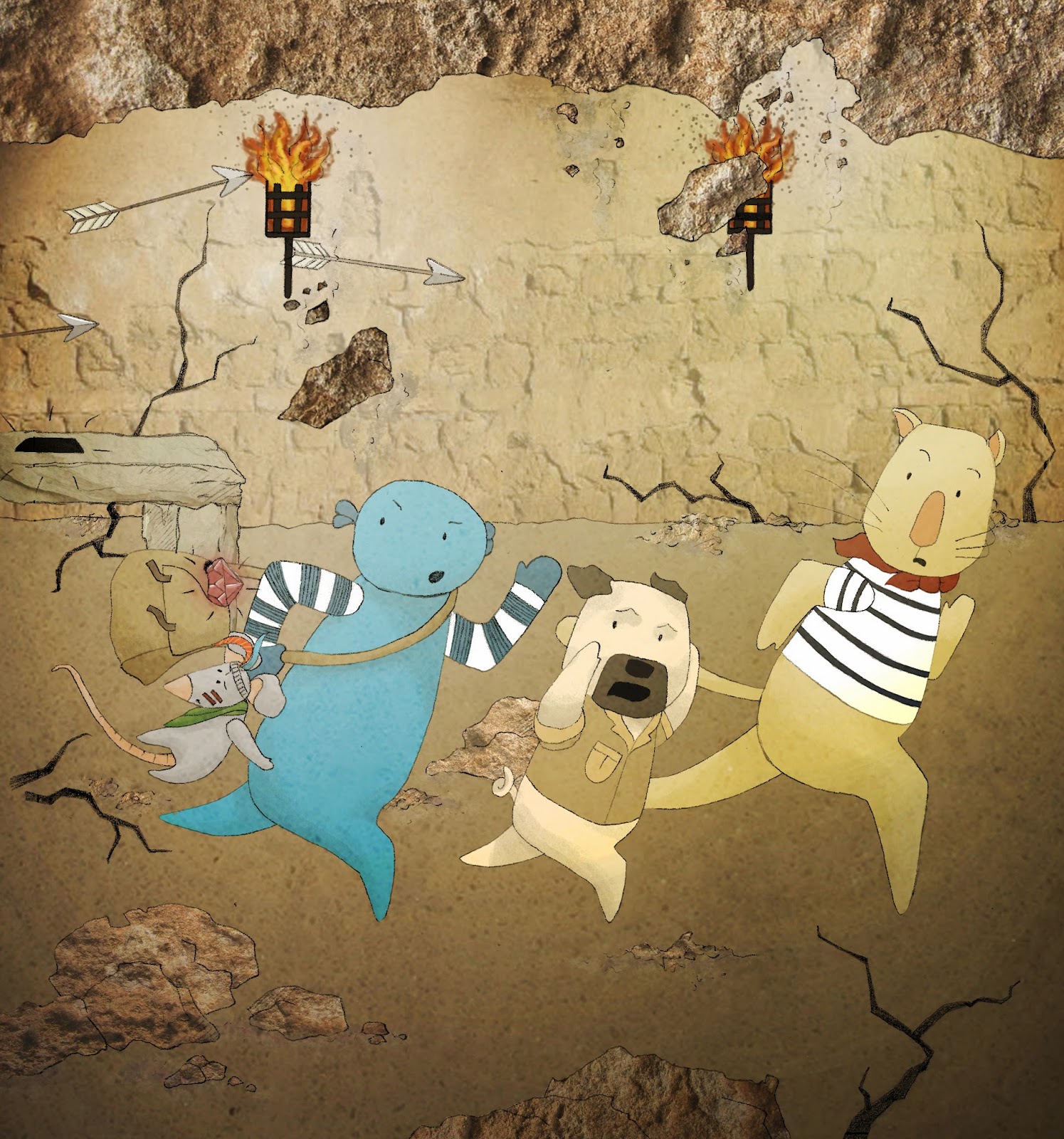
I used a very similar design to the one used within my 'Blue Pet' children's book work, however the layout had to be rearranged for this A4 sizing, and the elements used within the image where different. I designed a fairytale castle which would be suitable for both male and females, as this book was to be directed at male and females of university age. 

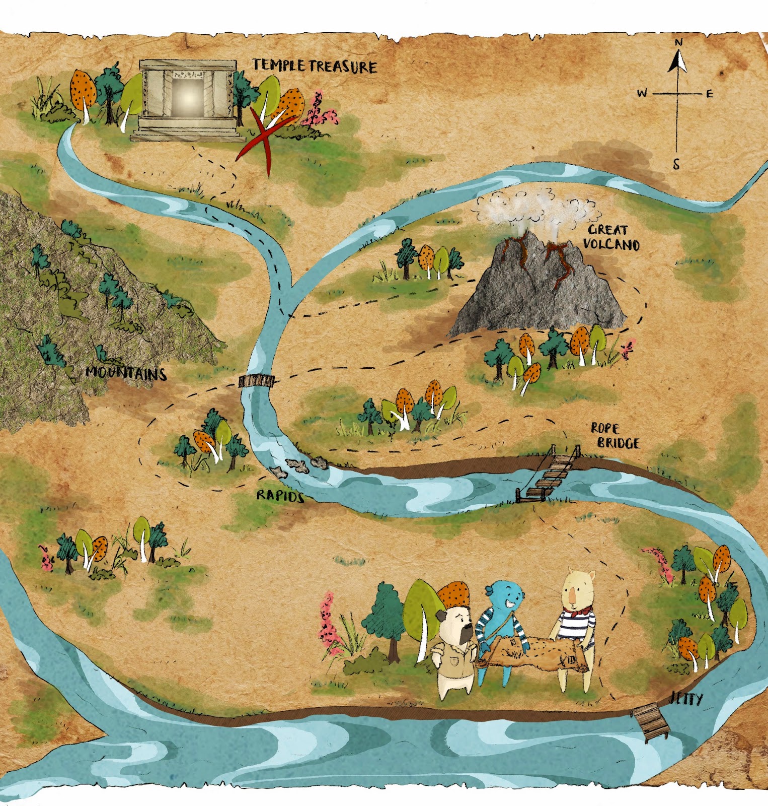
The background was a stock image of old parchment paper, which I used for all pages of the book. It gave that impression that you were following through the story as though you were continuing to read the map you see on the front cover - the idea that the whole book is the journey.

Chapter Headers

For the typography I hand drew it so I could get that much more control over it. It also meant where I was a bit more sketchy in colouring in the letters, when scanned in and the levels changed in photoshop, I could make it look more worn and aged for the 'old-map' aesthetic immediately through my pen work.
Originally the chapter titles above were going to have illustrative icons incorporated within them. However, I thought it would be better just to fully tie them in to the themed aesthetic of the old map, and I used a variety of "banners" as their backdrop settings.


Mediums used: Cover page and final work done in photoshop.
Original typography work done by hand using a 0.2 fine liner

Friday, 28 February 2014

Olivia for VP. Welfare and Community

Facebook cover photo
What a week of dedication, communication and hard work from a great group of people!
 I had the honour of being asked by Olivia to make her posters and flyers to help with her campaign within the University of Lincoln SU voting week for #Choosethevoice.
My poster used in Olivia's campaign
We were going for a look that suggested that all of the elements were on a desk surface and had a more random layout, so that things had just been "photographed" in their set down layout. This was done through the use of added textures of lined paper, pens, pencils and post-it-note-style speech bubbles.

Olivia's poster which was created to be A3, but also reproduced in A4

Olivia's double sided A5 flyer including a summary of her manifesto
Twitter header
Mediums used: I produced the artwork in photoshop with a selection of internet sourced textures, photoshop fonts and my own handwriting drawn with a drawing tablet
Photo credit of Olivia goes to Réi Retallick

Wednesday, 26 February 2014

Everybody has secrets that they'd rather keep hidden...


Based on the play 'Loot' by Joe Orton, we were tasked with creating a piece in any medium, size and form over a six week period.
I took the elements of secrecy and hidden secrets from the script. All of the characters have something that they are hiding; an element to their character that isn't clear at first.
I specifically worked on Nurse Fay and Hal.
I worked on the idea of "skeleton's in your closet" as Nurse Fay is hiding how she has killed off seven previous husbands, and Hal has stolen the money. This is why there are seven hidden diamonds on Nurse Fay's image, and pound signs in Hal's.
I also added an element of dias los muertos on their faces as it is like peeling away the facade of their appearance to reveal a more colourful and complicated self. Stripping them bare of masks, lies and hidden secrets.
The flowers come from the many flowers involved in a funeral, as Act 1 revolves around the preparations for Hal's mother's funeral, and then I researched their meanings and so I included flowers which had symbolic meanings in relation to the two characters.
For example the marigold - desire for riches; oleander - caution and daffodil - deceit.

Mediums used:
Black on white - white gouache on black mountboard
White on black - fine liner pen on white gouache

Wednesday, 15 January 2014

'The Blue Pet': Children's Book

Continuing on from the previous projects involving 'The Blue Pet' where we had to produce pages for a baby book and a graphic novel. We then had to take what we'd learnt from these two and produce a sequence of images for a children's book. There were four single pages and one final double page spread. You were given the captions for each page [as written below each image] and the character personalities:
Blue Pet: brave, optimistic, positive, outgoing, sunny disposition; Dog; inquisitive, full of opinions, bit of a snob, and nosey; Cat: kind, helpful, looks out for others, has a caring nature, puts others before him/ herself
From then on you pretty much had the freedom to illustrate the story how you liked including those specific details.
SINGLE PAGE 1: The runaway travelled on and met two new friends
Although the main method of colouring these illustrations was through using a drawing tablet in photoshop I also included texture elements, where I sourced images for things like the wood used on the boat and the jetty in this image. I mean that my illustrations would be full of colour but also had real texture on certain elements. I worked hard to keep them on the same level as the flatter colours, and not make them look odd and stand out from the image too much.
SINGLE PAGE 2: They were excited to see a distant light
SINGLE PAGE 3: They hatched a plan...
SINGLE PAGE 4: There was a terrific noise!
DPS: The thief escaped


Mediums used: Line art was done on layout paper using pencil, and was then scanned into the computer.
The colouring was done in photoshop using a drawing tablet and a range of different paintbrushes. Some of which belong to dommifox. I also used a range of textures which I sourced online for things like the map, rocks, and temple wall.


Blue Pet: Graphic Novel

"Having completed work for a very young audience you are now asked to consider an older audience...Consider bother the type of content and visual signature that appeals to the audience.
Produced a four page sequence as samples for a proposed graphic novel. Use the test as a starting point for the invention of a visual narrative which is an excerpt from a full, longer graphic novel...the images alone show convey the narrative and hold the reader's interest."
Mediums used: Drawn and "coloured" with stabilo fine liners. I wanted a rougher appearance to this graphic novel to make a distinct difference between the baby book - bold colours and clear shapes, to the more adult specific graphic novel with a scratchier and darker appearance.


Wednesday, 11 December 2013

History of Love

The last final piece to be completed for this end of term deadline haul! 
It's been a mission, but MISSION COMPLETE!

"Just open your palm to say forgive me."

I chose this quote because I found it quite striking out of the whole extract. 
It's a fairly simple piece, but there is actually more design depth than perhaps you initially see.
The background patterns are made up of things which symbolise forgiveness:
  • Row one is an African Adinkra symbol
  • Row two is a mixture of daffodils and hyacinths
  • Row three, the chinese symbol for forgivness
  • Row four is "Forgive" in braille
I also used the colour orange to colour my background because that is the colour to signify forgiveness. It has a underlying theme throughout.


Extract from the novel 'History of Love' by Nicole Krauss


Here are just a few of the colour developments I went through to choose my final colour palette. 
I did this using my drawing tablet in photoshop

Mediums used: Gouache paint on black mount board.

Tuesday, 10 December 2013

'Tis the Season to give presents

Amongst my crazy end of term deadlines I managed to whip up this crafty Christmas gift.


I used a glass bauble with a removable top so that I could insert the artificial snow, and the name tag. Then I tied the bow on top and attached some nice embroidery thread to have the decoration from.
The little "homemade" label was just a silly little idea, but it was fun to pretend like it was a product.


Then to top it off I created a quick christmas card, to go along with the snow in the bauble. I used some doilies and stuck them onto white card. This gave a very subtle background, but with the brown christmas tag I think it worked well in looking quite elegant.